

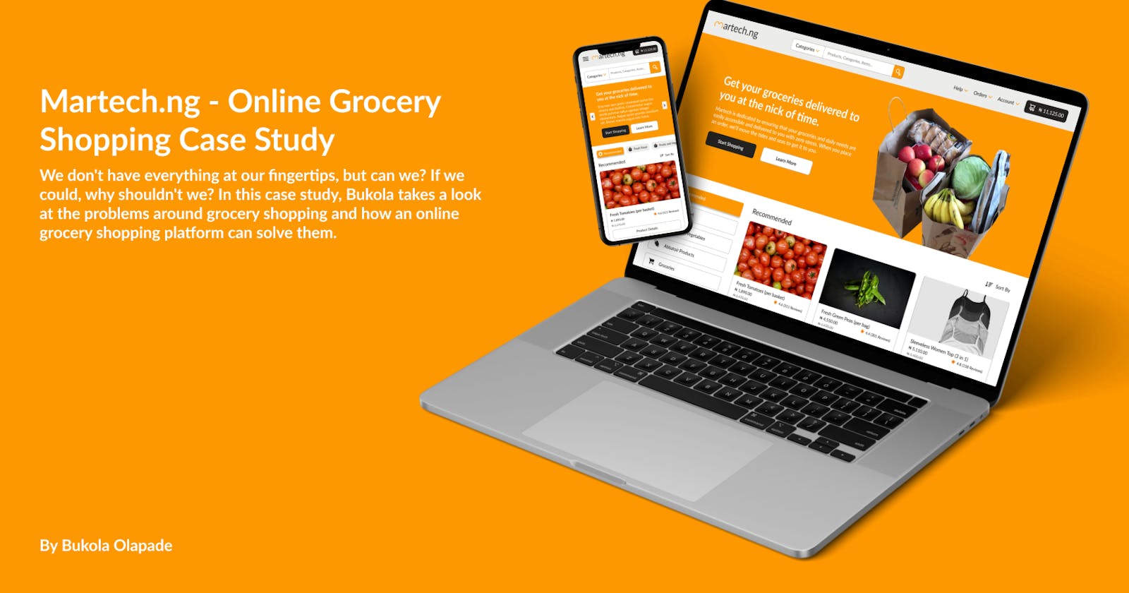


Martech.ng is an online shopping platform that allows users to quickly and comfortably purchase groceries and other daily necessities.
My Role
In April 2022, I joined Richfill Multiservices Enterprise and was tasked with leading the design team for an online shopping project from ideation to development. I was on the team with one of my female colleagues (Oluwamomi Olubadewo). Following the design phase, I was tasked with developing the project's front end using my knowledge of HTML, CSS, and JavaScript.
We were able to design the Martech.ng website and hand it over to the front end for production after two months, and I finished the front end and handed it over to the back end to complete production one month later.
Of course, I did not participate in every aspect of the UX process. I created the survey questionnaire, feature list, information architecture, empathy map, sketched the user flow and main designs, low fidelity designs, prototyping, and a significant portion of the final design (which included the homepage, support pages, profile pages, and product pages amongst others). It is still worth noting that my teammates provided ideas throughout the stages I listed above.
Research and Exploration
Going to local markets is still one of the best ways to get a lot of products cheaper than you will find in supermarkets in this part of the world. Most adults' lives revolve around going to the market or picking up groceries. If an adult does not do it, someone else does it on their behalf. We could almost say it is critical for survival. We don't have everything at our fingertips, but can we? If we could, why shouldn't we?
As an adult, I can attest that going to markets is a stressful experience. It is much more stressful as a Gen-Z adult because generational discrimination exists and most Gen Xers believe Gen Zs are easy to manipulate. It is also worth noting that the majority of sellers in local markets are Gen Xers.
There's also the stress of navigating a disorganized local market to find whatever you're looking for or enduring the stench that comes with markets. Supermarkets solve some of these issues for many people, but not all.
We decided to conduct some research to determine the most effective method of relieving the stress of local market shopping, or rather grocery shopping in general.
Online Survey
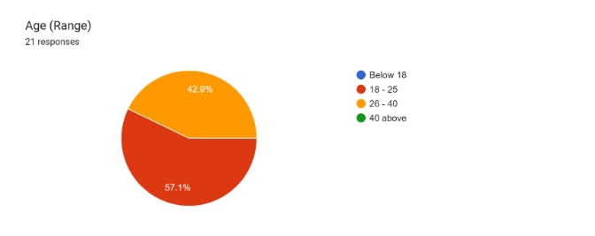
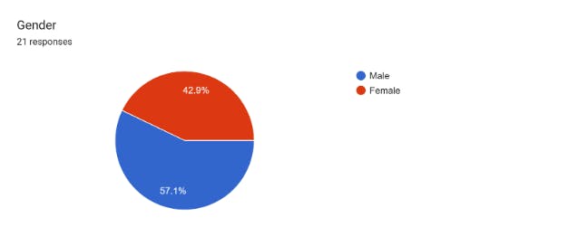
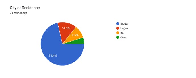
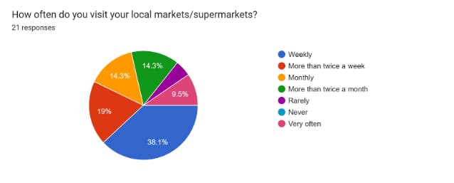
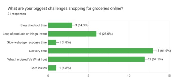
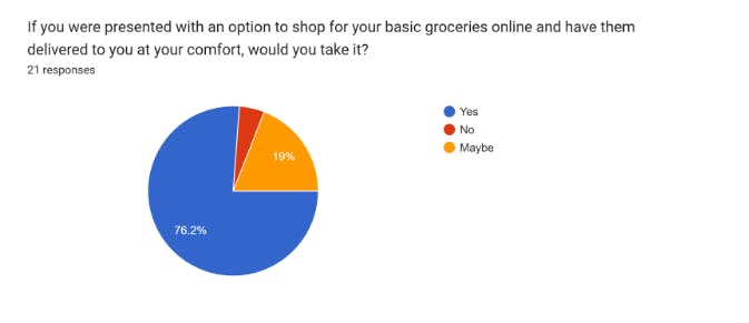
Online surveys are an effective way to reach a large number of people, but they may not be the most effective way to cover all age groups. We conducted an online survey and were able to reach people aged 18 to 40 in various Nigerian cities to learn about the stress of physical grocery shopping and the adoption of online grocery shopping. The survey questions and responses are listed below.
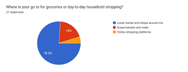
Pause. I'd like to point out that the majority of people consider market or store accessibility to be very important. Given that the people who completed this survey have decent internet access, we can say that an online store would be very accessible to them.
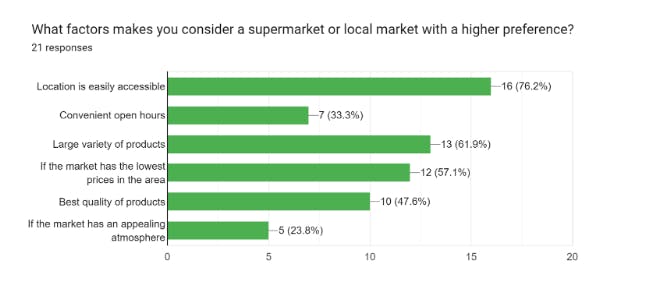
My teammate and I took note of all the points in this section as issues that the online market must address.
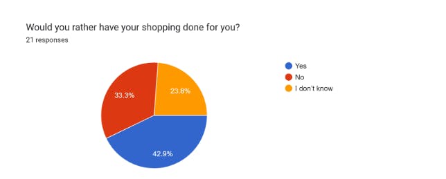
Another brief pause. We discovered a technical problem right here. 33% of those who responded to this survey said they do not want their shopping done for them. But can we say that when you order things online, someone is doing your shopping for you? Is it just with groceries that it's different?
This became an issue because the company's proposed business model was to go help them get their orders from local markets after they ordered. This implies that they would have someone do their shopping for them. To satisfy this technical hitch, we proposed that the company set up plugs in supermarkets for items displayed, and we would simply go pick them up and deliver them to the user.
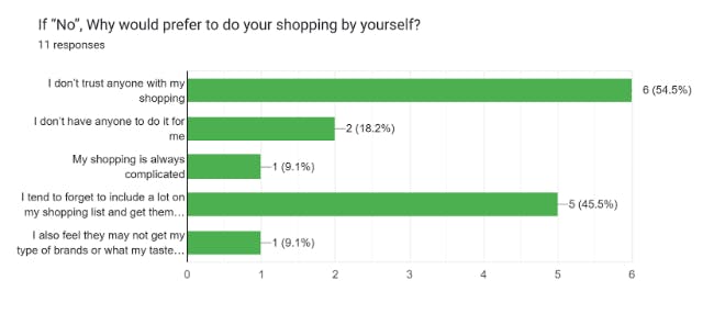
Moving on, we inquired as to why they would not prefer that someone shop for them. Our first solution addressed the issue of trust, and an online shopping platform addresses the problems of not having someone do it for them, forgetting to include items (because they can add them at any time), and variety.
Keeping in mind that our survey only allowed us to reach people aged 18 to 40, we decided to conduct another survey (via person-to-person interaction and phone calls) specifically aimed at people aged 40 and up, and the results were somewhat similar, except that their access to technology influenced their responses.
Empathy Mapping and User Stories
The person-to-person interaction survey that we conducted was the most interactive. We were able to interact with people and see their pains in their faces rather than just through their words. We then decided to create an empathy map using a template from the Figma community.
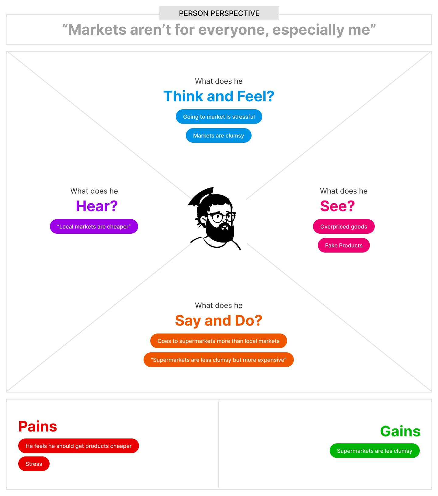
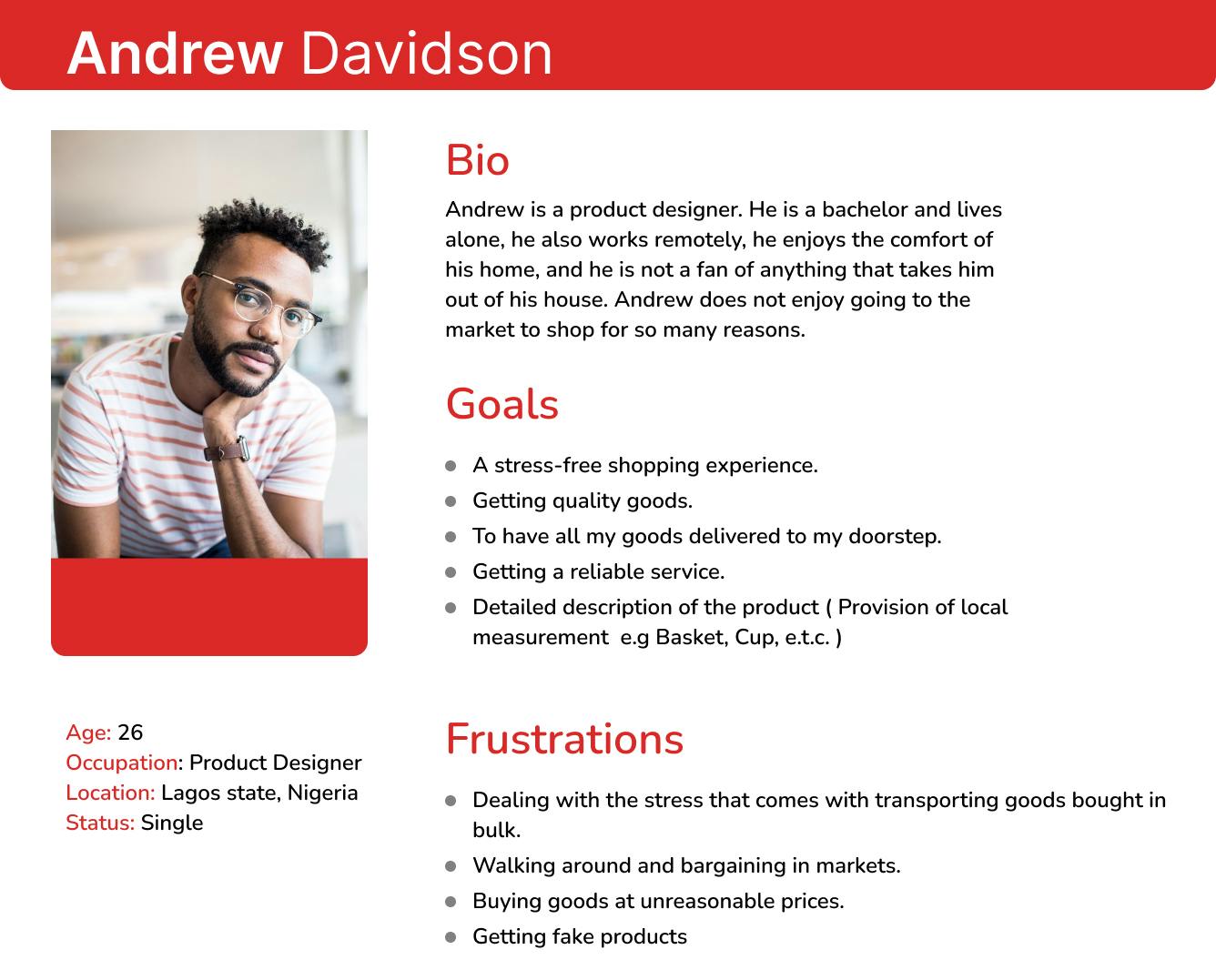
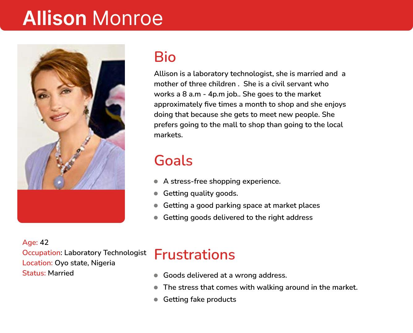
We also decided to use the surveys as studies to create user personas and stories. My teammate was tasked with this and did an excellent job. I'd like to share these with you.
Moving on, we decided to concentrate on the product we want to create, which would be insignificant without considering the market competition, feature list, information architecture, and user flow.
Competitive Analysis
When someone has an idea, they may want to believe that it is the first of its kind because they are unaware of anything similar. A competitive analysis assisted us in better understanding the online grocery shopping market and online shopping in general. We limited our search to companies in the country that are doing similar work to what we want to do, and we investigated how they operate and any issues they may be experiencing. To view the competitive analysis, please click here.
Features List
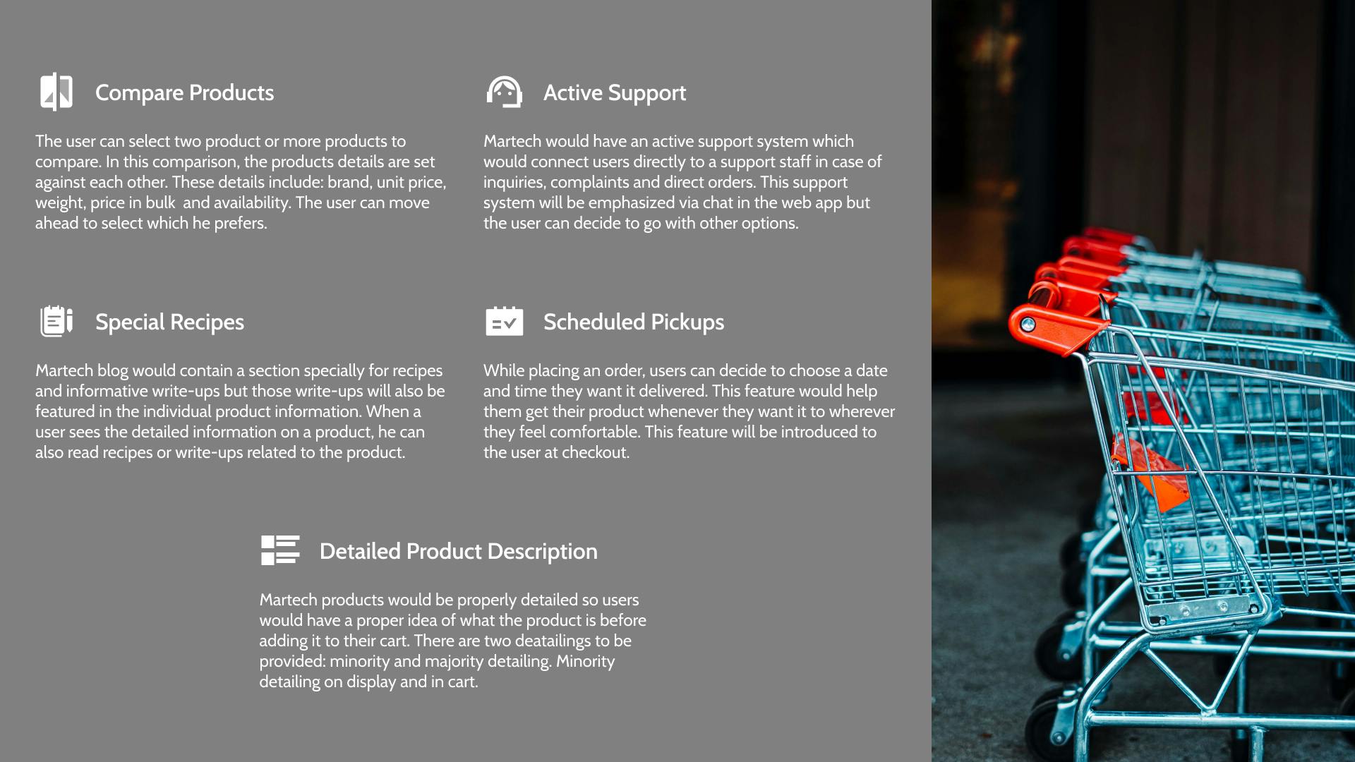
After considering the competitive analysis, survey results, and empathy map, we developed the above features for Martech.ng. It was sent to the production team, but the first item on the list was removed. It was claimed that comparing products would be difficult to implement and possibly unnecessary. It was suggested that it be considered in future versions of Martech.
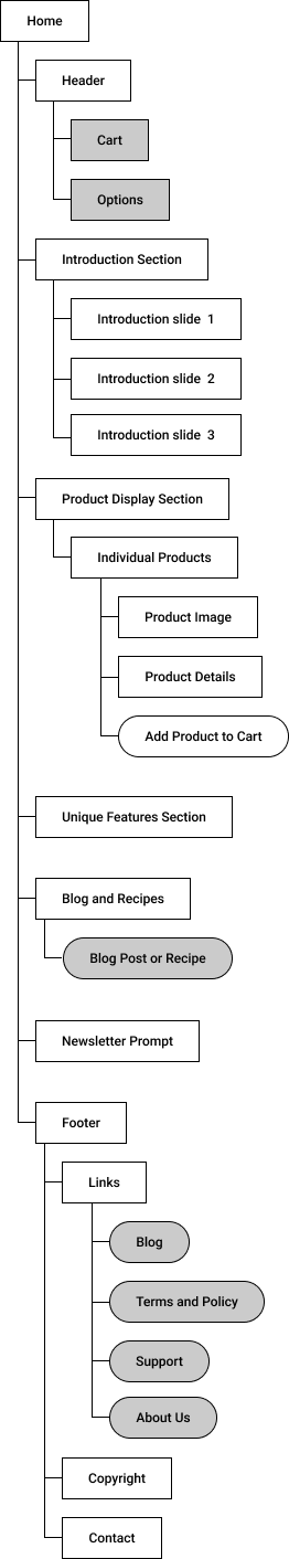
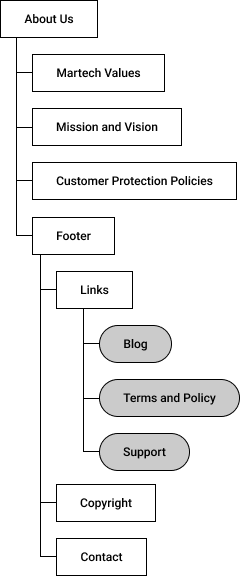
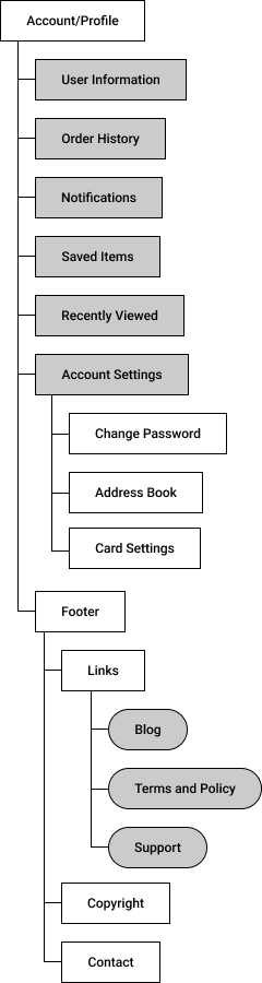
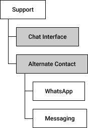
Information Architecture
Moving on, we made a list of the pages that would be important for the project and designed the information architecture for some of them.
Sketches and User Flow
I also moved on to sketch the major pages of the project, as well as the user flow, which my teammate documented with Whimsical. If you want to see both, the links are provided below.
Here is the link to the sketches.
Here is the link to the user flow on Whimsical.
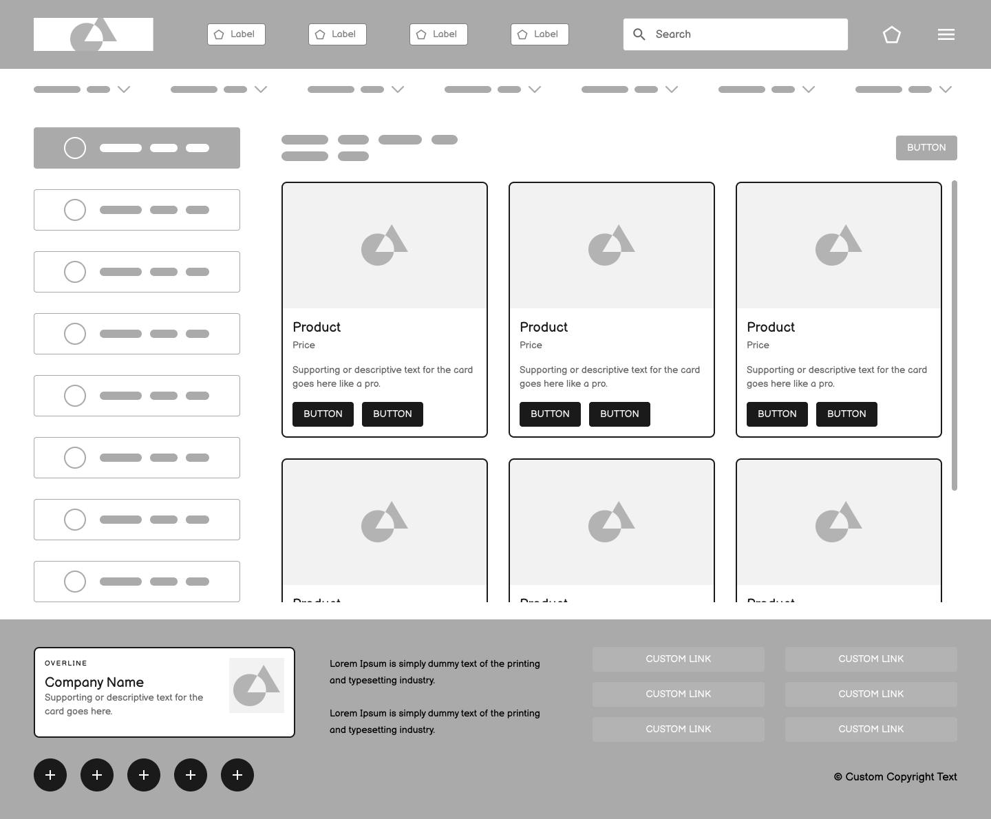
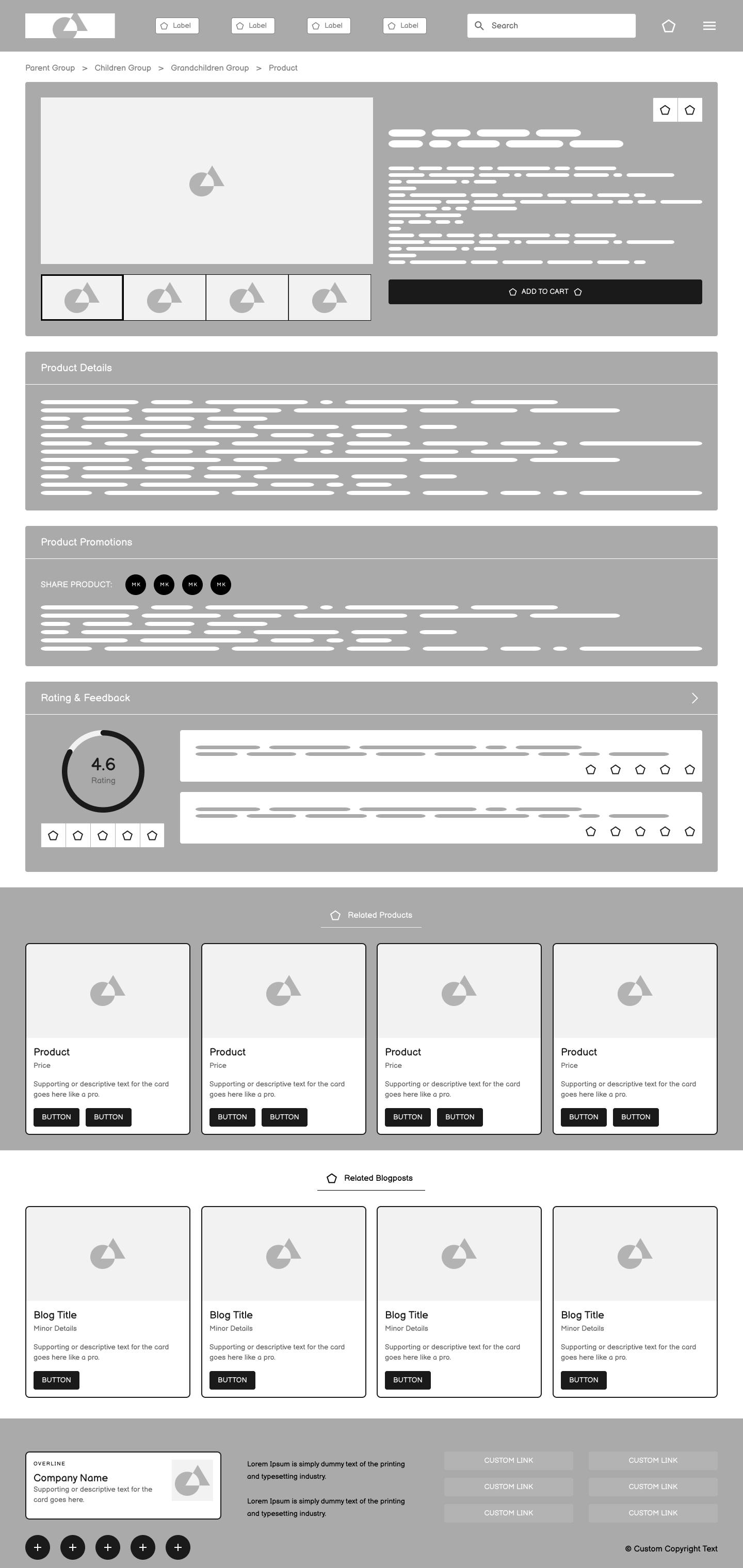
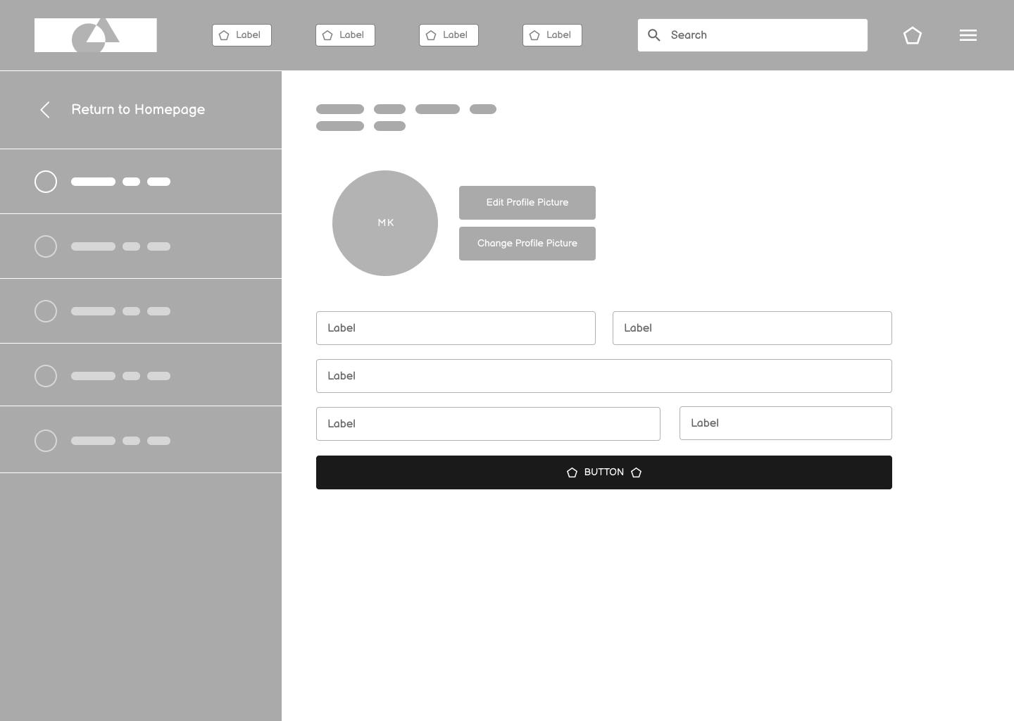
Low-Fidelity Wireframes
We created low-fidelity wireframes for major pages to help us visualize things from the sketches and make our features more clearly. Here are a few examples.
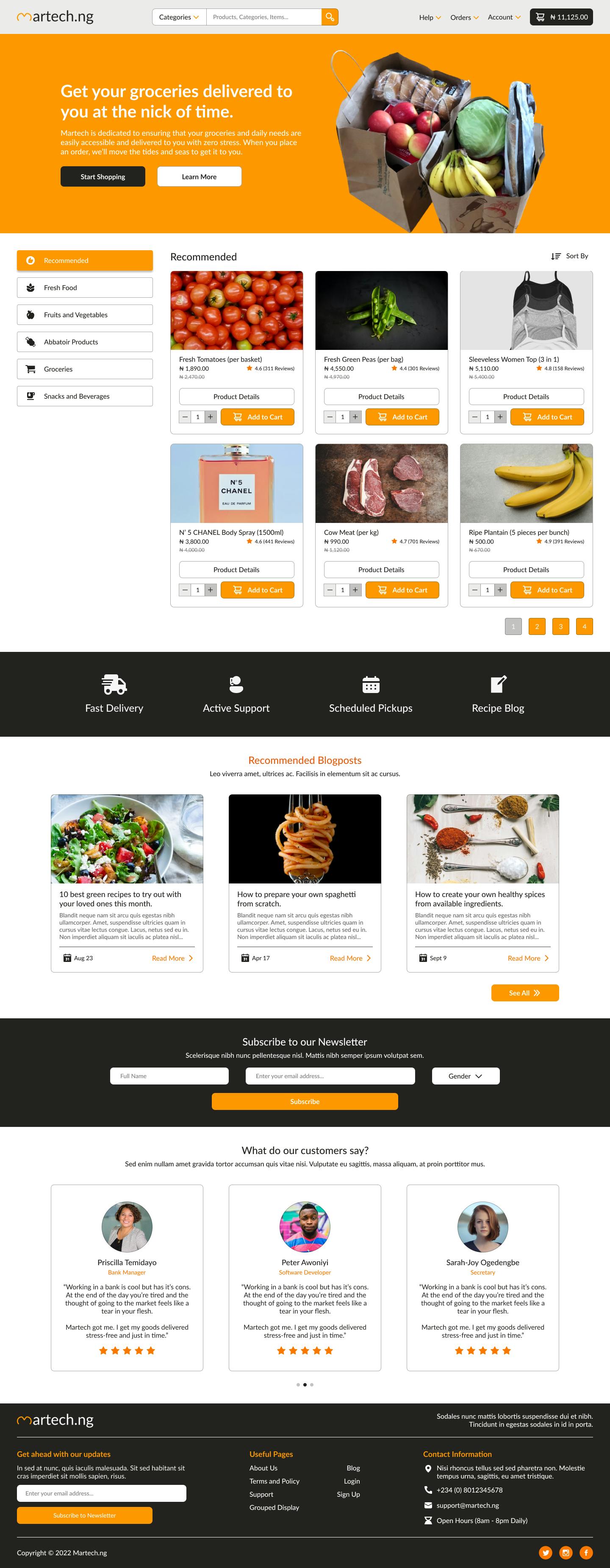
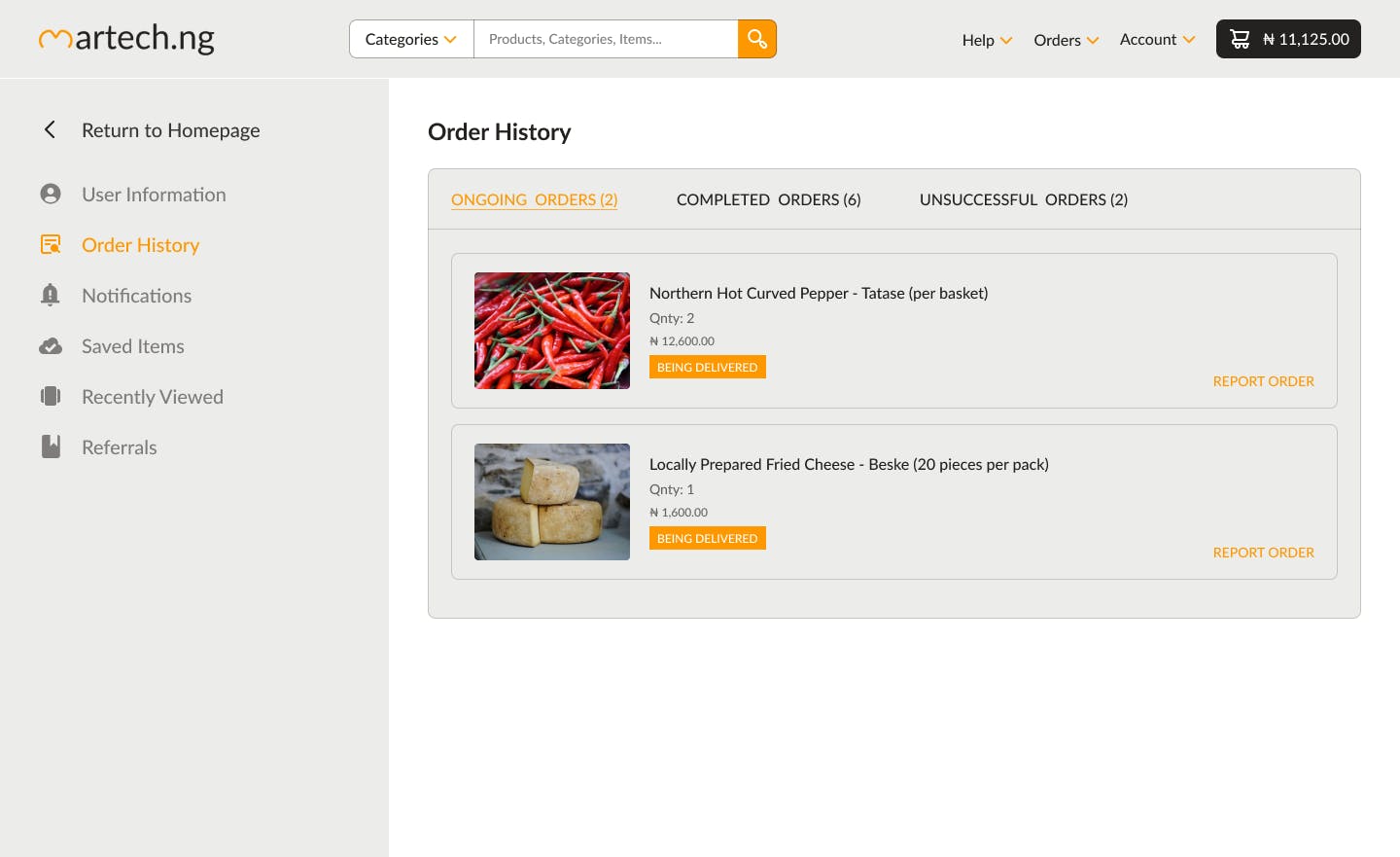
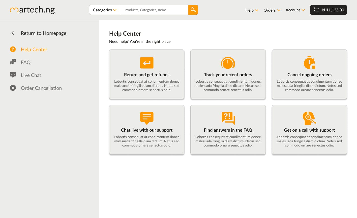
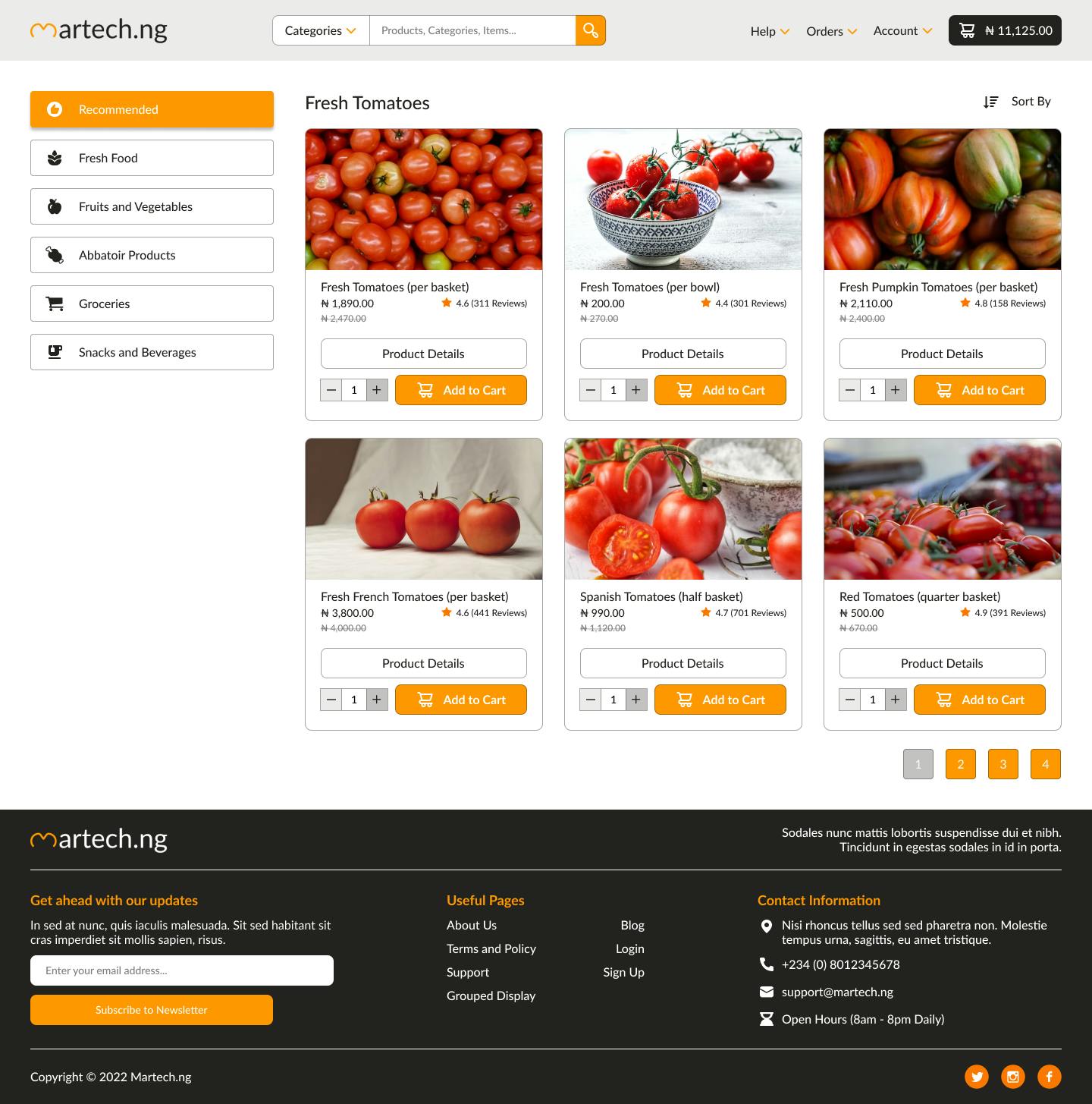
Main Design
And as a result of our two months of work, we ended up with these lovely UX-friendly designs. Totally worth it.
... amongst a few.
Conclusion
I am still in the business of creating amazing UI/UX designs on the side, and I am also available for full-time design roles. Please contact me if you have any questions, suggestions, or critical analysis.
Thank you for your time. Peace.